
This is the Batman Issue of Total Film magazine, as you can see the only thing on the cover is Batman. For this issue the whole of the magazine has been made in a black theme this is done to highlight the fact that this issue of the magazine is of Batman. Even though it is a very basic cover it is used effectively because most people do know who this iconic character is. The only writing on this cover is 'ROUGH JUSTICE THE DARK NIGHT WAGING WAR ON TERROR'
this attracts the audience not just by the colour but because this is a catchy tag-line it gives the audience an insight into what this film is about.
Monday, 25 January 2010
Tuesday, 19 January 2010


Here are two posters from the film 'Jumper', these posters appeal to me in different ways and i think in a way both had an effect on the final making of our poster.
The poster on the left shows what appears to be the main character, you do not get a clear image of who this character is. What works well with this poster is the way in which the character is placed, he is placed in the middle of the poster and he is framed by the two pyramids and the sphinx he is standing on, by the designer of the poster doing this it allows the audience to infer that he is the main character.
The poster on the right allows us to see who the main character of the film is which is Hayden Christensen, most people will know who he is from appearing in 3 of the very successful 'Star Wars' films. What works well in the poster on the right is that it centers Hayden Christensen and places images of landmarks of different countries at the bottom the poster, it appears as if he is looking down upon them like he is superior. The writing in the top left corner which is 'From the director of, The Bourne Identity and Mr & Mrs Smith' would attract the audience of both these films, and also would attract the audience of the director, after both them two films were successful.
Friday, 15 January 2010

This is the concept design for our magazine cover. We designed this magazine cover to be like that of over magazine covers we have studied such as Total Film Magazine and Empire Magazine, we used the basis of each magazine to design our magazine cover, we came to the conclusion that with the magazine covers there is always a main focus this allowed us to create our magazine cover to have the main focus of our film but not completely fill the cover with just our film.
We kept the main focus on our film but added other features to the magazine cover which is;
~Adding names of other films on the magazine which can be seen on the far right of the cover this again we adapted from real magazine covers.
Also we added drawings of one of the films listed above this gave more variety to the magazine.
~At the far left of the magazine we added names of those who would feature in 'Out Of Time', we also added that there would be free photos from the set of the up and coming film, by doing this it would attract audiences in wanting these free items.
The masthead of our magazine cover is 'B4 Release'. My group and I thought this was a very catchy name and by designing the title in two different fonts it attracts the audience.
~We added other minor details to the magazine cover but are still very inportant points, these things are the price of the magazine, above the masthead is a tagline for the magazine, and the magazines website which is listed just below the masthead.
Tuesday, 12 January 2010


 Here are some images we used in our trailer, i believe that these shots are highly effective because it allowed us to create a shot reverse shot with our character coming down the stairs, we done this be recording at the top of the stairs then reversing it and filming him come down the stairs.

 These images were used to get the idea of where to film our trailer and allow us to create the right angles to film, as you can see with the picture of the London eye it is taken at a low angle this was used to intentionally to create the power of superiority we gained this effect by making our main character stand in front of this high angle shot thus making him looking superior.
Friday, 8 January 2010


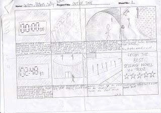
This is our first draft version of our story board, it looks basic but our understanding of it will allow us to use it effectively and create or even elaborate on the angles we record the scenes from.

This is the shooting plan for our trailer 'Out Of Time'
as you can clearly our shooting plan is short and simple but im sure will be a very effective piece of planning.

This was our initial idea for the Out Of Time poster, we used the bases of this idea to create our final design.
This design for the poster was exactly what we was aiming for which was;
~To create the impression the man at the bottom of the of the poster was insolent and inferior to the image of the man above him,we also created the impression that our character was running away from something you can see this in this design of the poster.
~As you can see iconic landmarks are on each side of the two characters, one being the london eye, the other being big ben. There was a chance that creating this type of image from the resources we had would be a problem but me and my team believed that we would overcome this problem.
~Our tagline 'Two Men, One Woman, On A Countdown' i believe matches our film well by adding the fact that there is a countdown in our tagline it matches the name of our film 'Out Of Time'.
Subscribe to:
Comments (Atom)